Website messaging hierarchy for service businesses
The direct answer
A website messaging hierarchy arranges brand and sales messages in the order a visitor needs them: category and relevance first, customer tension second, promise and difference next, proof beside the claims it supports, and service detail only after the visitor understands why the business matters.
Five conclusions
The argument, compressed.
- The first screen should establish category, relevance, and direction before introducing every capability.
- Message order should follow the visitor's questions rather than the company's internal structure.
- Proof works best beside the claim it validates instead of inside one distant testimonial section.
- Service details become easier to value after the visitor understands the promise and distinctive method.
- A strong hierarchy reduces cognitive effort while preserving strategic depth.
Working framework · 5 decisions
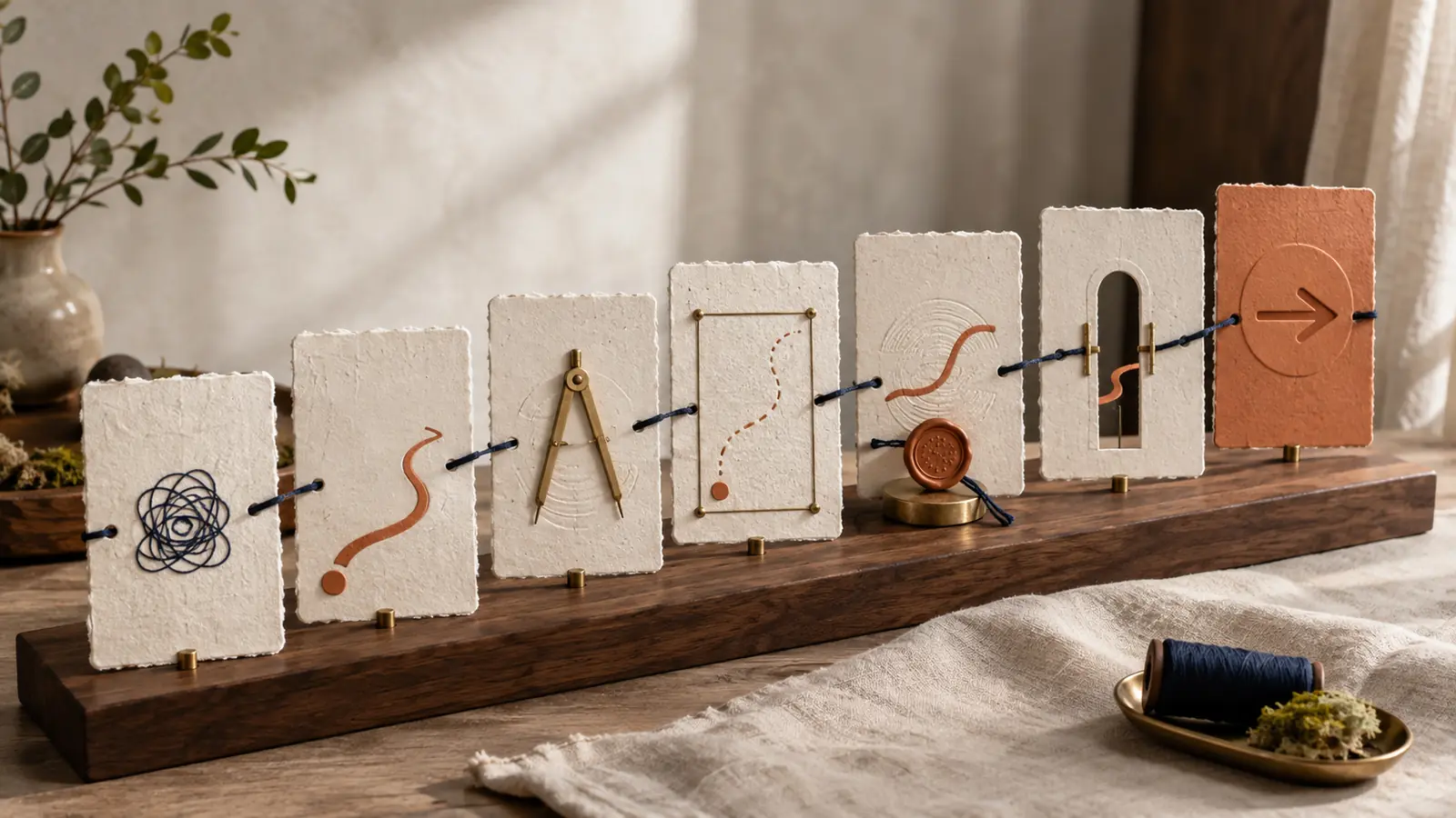
The five layer website message stack
Each layer answers the next question forming in the visitor's mind, turning a long page into a guided decision rather than a catalogue.
Decision 01 / 05
Orientation
Name the category, audience situation, and direction of change.
What website messaging hierarchy means
Website messaging hierarchy is the order in which a business introduces meaning. It decides which idea receives the most visual and verbal emphasis, which questions are answered next, and which details wait until the reader has enough context to value them.
A service business often has more knowledge than the visitor can absorb at once. The website may need to communicate positioning, expertise, services, process, proof, personality, and a next step. Hierarchy prevents all of those messages from arriving at equal volume.
The goal is clarity with depth. A strong hierarchy makes the first decision easy while allowing a motivated reader to continue into evidence, method, and detail.
Hierarchy rule
The most important message is rarely the sentence the founder is most excited to say. It is the sentence the visitor needs before the next sentence can make sense.
Why service business websites become crowded
Many service websites inherit the structure of the company rather than the decision process of the customer. Departments become navigation items, capabilities become sections, and internal terminology becomes headings. The visitor receives a map of the organisation before understanding the value.
Another source of crowding is fear. Teams worry that leaving one capability below the fold will make it invisible, so every service competes for the opening screen. The result distributes attention so evenly that nothing feels important.
A hierarchy creates permission to delay information. Delayed information is still available. It simply arrives after the reader has a reason to care.
1. Begin with orientation
The first screen should help a visitor answer three questions quickly: what kind of business is this, is it relevant to my situation, and what direction of change does it offer?
Category language creates a comparison frame. Audience tension creates relevance. The promise creates movement. These elements can live across a headline, supporting line, visual, and short action rather than being compressed into one overloaded sentence.
Avoid beginning with an abstract ambition that could belong to several industries. A phrase about unlocking potential may sound expansive while leaving the visitor unsure whether the business provides consulting, software, coaching, or design.
- Can a visitor arriving for the first time name the category after one screen?
- Does the opening describe a recognisable customer situation?
- Is the promised movement understandable without reading the services list?
- Does the first action match the visitor's current level of confidence?
2. Create recognition before explanation
After orientation, the page should show that the business understands the customer's present reality. This is where the visitor recognises the cost, friction, or contradiction that makes the service relevant.
Recognition works through specific observations rather than theatrical pain language. A founder may explain the business clearly in conversation while the website sounds like every competitor. A team may publish consistently while each channel teaches a different identity. Those situations feel credible because they are observable.
This layer earns attention for the explanation that follows. The reader sees their situation reflected before encountering the full method.
3. Explain the promise and distinctive choice
Once the visitor understands the problem, introduce the change the service is built to create and the choice that shapes how the work happens.
A promise describes the useful movement. A distinctive choice explains why this business approaches that movement differently. The difference may sit in research depth, sequence, specialisation, collaboration, access, or the way several disciplines are combined.
Connect the method with consequence. A process diagram earns its place when it helps the visitor understand why the result becomes clearer, faster, safer, or more coherent.
Message test
If the method can be removed without changing the promise, the difference may still be decorative rather than operational.
4. Build belief beside the claim
Proof should appear where doubt forms. A claim about strategic depth can be followed by a diagnostic framework or case study decision. A claim about consistency can be followed by connected touchpoints. A claim about commercial effect can be followed by a verified outcome with context.
One large testimonial section near the bottom forces the reader to remember several earlier promises and decide which quotation supports which one. Distributed proof reduces that mental work.
Use several proof forms because they answer different doubts. Work samples demonstrate quality. Case studies demonstrate judgement. Process evidence demonstrates repeatability. Customer language demonstrates experienced value.
- Place proof immediately after high stakes claims.
- Name the context behind every result.
- Use case study decisions rather than outcome numbers alone.
- Show enough of the method to make expertise visible.
- Keep testimonials specific to the value they support.
5. Match the action to the reader's confidence
A call to action works best after the page has answered the questions required for that commitment. Asking for a project enquiry in the first screen can still be useful for returning or referred visitors, while a second quieter action can support people who need more evidence.
The page can offer progressive actions: explore the method, review relevant work, compare services, then begin a conversation. Each action should feel like a natural continuation of the message above it.
Avoid replacing clarity with urgency. A service buyer often needs confidence in fit and judgement before speed becomes persuasive.
Give the homepage and service pages different jobs
The homepage explains the brand level position and helps the visitor choose a path. It should establish category, customer situation, central promise, distinctive point of view, proof, and the main service routes.
A service page goes deeper into one buying situation. It can name the specific tension, explain the scope, reveal the method, answer objections, show relevant evidence, and clarify what happens next.
Repeating the same generic opening across every page wastes the opportunity created by search intent. Each service page should begin where that reader's question begins while remaining recognisably connected to the master message.
How to audit the current message order
Capture the page as one long image and label the job of every section. Mark where the category becomes clear, where the customer recognises their situation, where the promise appears, where difference becomes visible, and where proof enters.
Then read only the headings in order. The heading sequence should tell a coherent story without relying on paragraph copy. If the sequence jumps from a broad promise to a service grid, then to founder biography, then back to the customer problem, the page is asking the visitor to assemble the logic.
Finally, test the page with someone outside the business. Ask what the company does, who it serves, why it differs, and what action the page suggests. Their answers reveal which messages survived the hierarchy.
- Which idea receives the greatest visual emphasis?
- What question does each section answer?
- Does every section prepare the next one?
- Where does proof arrive relative to the claim?
- Which details could move later without reducing understanding?
Common website messaging hierarchy errors
The first error is leading with the founder's philosophy before establishing category and relevance. Philosophy becomes more valuable once the reader understands what decision it changes.
The second is placing all services at the top. A long capability list creates choice before context, making comparison harder rather than easier.
The third is separating every proof point into one distant block. Claims feel unsupported during the exact moment doubt appears.
The fourth is using visual scale to decorate rather than prioritise. Large type should signal strategic importance rather than simply create drama.
The fifth is making every call to action equally loud. Actions should reflect different levels of visitor readiness.
Before you use it
Questions that can change the recommendation.
What should a service business website say first?
It should first establish the category, the customer situation it serves, and the direction of change it offers. Service detail becomes easier to understand after that orientation.
What is the difference between messaging and messaging hierarchy?
Messaging defines the ideas a brand needs to communicate. Messaging hierarchy decides their order, emphasis, and relationship across a page or journey.
Should services appear above the fold?
A short service route can appear early when it helps orientation. A full capability list usually works better after the visitor understands the position and customer relevance.
Where should testimonials appear on a website?
Place specific testimonials near the claims they support, then use a broader proof section where the visitor may want additional confidence before acting.
How many messages should a homepage contain?
A homepage can contain several supporting messages, but one central position should lead. Each section needs a distinct job inside the same story.