Why a beautiful brand identity can still be forgettable
The direct answer
A beautiful brand identity becomes forgettable when its visual choices are attractive but weakly attributed to one brand, disconnected from a clear market meaning, used inconsistently, or changed before familiarity can form. Beauty can earn attention. Recognition requires distinctive cues repeated in connection with a useful association.
Five conclusions
The argument, compressed.
- Aesthetic quality and memorability solve different problems.
- Recognition depends on cues that people can attribute to one source.
- Distinctive assets need a clear category or customer association.
- Constant creative reinvention interrupts the familiarity needed for memory.
- A strong identity balances variation with a stable recognition spine.
Working framework · 5 decisions
The recognition spine
Five conditions turn attractive expression into an identity that becomes easier to recognise over time.
Decision 01 / 05
Perception
Make the cue visible enough to survive real sizes, speeds, and viewing conditions.
Beauty and memory are different jobs
A visual identity can be elegant, sophisticated, contemporary, and carefully crafted while leaving a weak memory trace. Aesthetic quality influences attention and judgement. Memorability depends on whether the viewer can recognise the source and retrieve a useful association later.
Design reviews often reward the quality visible in one presentation. Customers experience the identity in fragments: a profile image, a proposal cover, a mobile page, a social post, an email, or a brief glimpse inside a busy category.
The useful question is wider than whether the identity looks good. Which cues survive those fragments, and what do they teach the customer to remember?
Useful distinction
Beauty can make an appearance rewarding. Distinctiveness helps the appearance belong to someone.
The category may already own the aesthetic
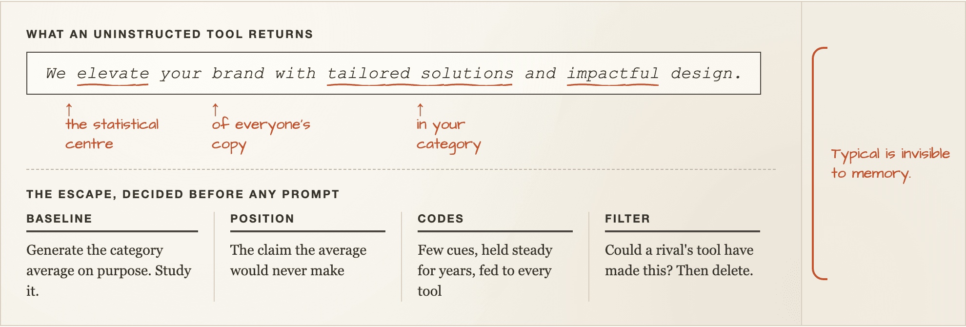
Many industries converge around the same visual codes. Premium service brands may share restrained typography, neutral colour, editorial photography, and generous space. Wellness brands may share earth tones, soft gradients, natural textures, and calm motion.
These choices can communicate category membership efficiently. They can also make attribution difficult when every competitor draws from the same visual vocabulary.
A strong identity decides which category codes should remain for comprehension and which elements should break the pattern enough to create recognition.
- Which visual choices help customers understand the category?
- Which choices are already used by close competitors?
- What can change without making the offer confusing?
- Which cue could become attributable through repetition?
The logo is carrying too much responsibility
A logo is one part of a recognition system. Customers frequently encounter the brand before the logo becomes large or legible enough to perform meaningful attribution.
When colour, typography, image direction, layout, voice, motion, and recurring formats remain generic, the logo has to rescue every appearance. Cover the mark and the rest of the system loses its source.
Build several connected assets so recognition can occur through the whole composition. The logo should confirm the source rather than introduce it from zero each time.
Distinctive cues lack a useful association
A recognisable shape or colour can help people identify a brand. Commercial memory becomes stronger when that cue is also connected with a category, customer situation, promise, or point of view.
Without meaning, the audience may remember that the work looked interesting while forgetting what the business does or when it becomes relevant.
Connect repeated visual moments with repeated message territory. Over time, the cue and the meaning begin supporting one another.
Memory test
Recognition answers who made this. Association answers why that brand should come to mind now.
Creative variation becomes identity drift
Brands need variation to remain expressive across campaigns, formats, audiences, and moments. Variation becomes drift when every new execution discards the cues that helped the previous one become familiar.
The problem often appears inside social content. Each post is designed as an isolated composition, so the feed demonstrates range while attribution resets repeatedly.
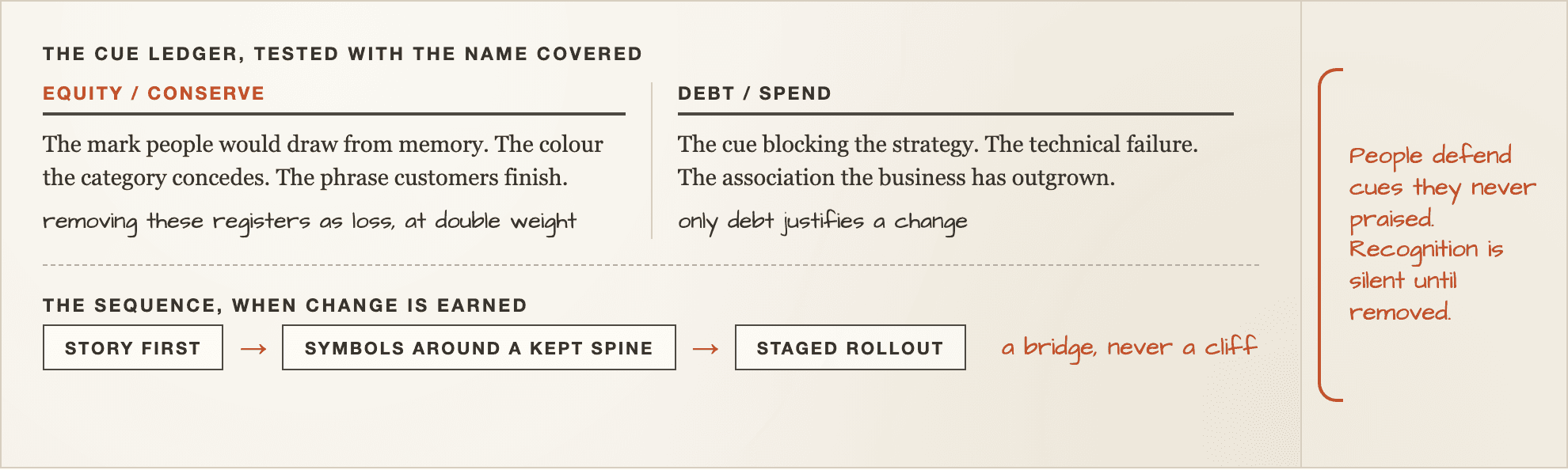
Define a recognition spine: a small group of assets and rules that remain stable while colour emphasis, imagery, scale, composition, and motion can change around them.
- Which two or three cues should survive every campaign?
- Which parts can change freely?
- Which combinations create the strongest attribution?
- At what point does variation begin to resemble another brand?
The identity changes before familiarity can form
Internal teams see their identity far more often than the market does. Familiarity inside the business can feel like fatigue while customers are only beginning to learn the system.
Frequent redesigns, seasonal overhauls, and campaign specific reinvention can interrupt the repetition required for recognition. The brand keeps presenting new evidence before the previous evidence has accumulated.
Refresh expression when the system needs range. Replace foundational assets when research shows they create confusion, poor attribution, technical failure, or strategic mismatch.
The identity falls apart in real use
An identity can feel distinctive inside a controlled presentation and weaken when handed to a growing team. Complex compositions become simplified. Image direction becomes generic. Motion disappears. Templates preserve spacing while losing the idea.
Test the system inside the formats the business actually produces: mobile screens, proposals, social posts, case studies, email, video, documents, and sales material.
A memorable identity needs assets that are distinctive enough to recognise and practical enough to repeat without constant art direction.
How to audit a forgettable identity
Collect recent customer facing work and remove the brand name and logo where possible. Ask whether the remaining pieces feel attributable to one source. Then place the materials beside close competitors.
Test recognition separately from preference. A participant may prefer one design while attributing another more accurately. Both findings matter, but they answer different questions.
Finally, ask what people believe the brand offers or stands for after seeing the materials. This reveals whether the identity carries meaning as well as source recognition.
- Perception: can the important cues be seen at real sizes?
- Difference: do the cues separate the brand from close alternatives?
- Attribution: can viewers connect the execution with the correct brand?
- Association: do viewers remember the intended category or promise?
- Repeatability: can the team reproduce the system consistently?
Strengthen recognition without redesigning everything
A complete redesign may be unnecessary. Begin by identifying existing assets with some familiarity, meaning, or operational value. Strengthen their usage before replacing them.
Choose one or two underused cues and make them more visible across high frequency touchpoints. Connect them with a stable message territory. Reduce visual decisions that compete with those cues.
Measure attribution and recall after sustained use. Recognition is built through the pattern the market receives, rather than the number of options contained in the identity guide.
Before you use it
Questions that can change the recommendation.
Can a beautiful logo still be forgettable?
Yes. A logo can be attractive while resembling category conventions, appearing too rarely, or lacking supporting assets that make the wider identity attributable.
What makes a brand identity memorable?
Memorable identities combine perceptible and distinctive cues with consistent attribution, a clear category or customer association, and enough repetition for familiarity to form.
Does a brand need to look unusual to be distinctive?
No. Distinctiveness requires recognisable separation, rather than novelty for its own sake. A familiar category language can remain while selected cues become uniquely attributable.
How often should a visual identity change?
Change foundational assets when strategy, audience, category, technical needs, or research justify the cost. Creative expression can evolve more frequently while the recognition spine remains stable.
How can a small business test brand recognition?
Show real materials with the name hidden, ask participants to identify the source, compare the work with close competitors, and record which category or promise they remember afterward.